We all grew up in an internet world where sites have pages to look like books. But those who created that trend forgot that books 'have to' consist of many pages to be easier for the readers to hold them, put them in their bags, bookmark where they reached, and above all save space.
 But do you know that before books people used to write long content in a very long manuscripts that they used to roll. It was not handy of course and made life very complicated for readers back then. But let’s face it, reading was more appreciated and people were more engaged to the read content. Right? It was not about how many pages did I read today but what did I in terms of chapters or books or ideas.
When it comes to the internet, our modern source of information, we use websites to nourish our minds. Do we want content on these websites to be engaging and fluid or we want to navigate between pages, sections, and categories?
The answer to that is not easy nor simple. Because it depends on what content do you have and how do you want to present it and above all who is your target audience.
But the Key is:
YOU WANT TO KEEP THE FLOW! and DON'T WANT TO BREAK THE NARRATION while being well-indexed on search engines and have easy on site navigation
‘Single page themes’ / ‘One Page Website’?
The websites in this article let you scroll, but they also provide alternative ways of finding cues and means for getting around. In several cases the designs encourage exploration, which is both more engaging and also teaches you how to navigate at the same time.
Jess and Russ
The Jess and Russ’s website is a wedding invitation, though it’s also something more. As it says at the top of the page, it is the story of Jess and Russ leading up to this moment. It’s a narrative that begins with a few details before they had met, leads to their meeting and falling in love, and culminates with the invitation (complete with RSVP form). How do you navigate a story that’s told linearly through time? Sure, there are flashbacks and other narrative devices, but for the most part you tell the story from beginning to end. You move through it in a straight line and so here the navigation is simply scrolling through the page. Nothing more is needed.
I started this post suggesting we could provide more than scrolling. This example shows that, at times, scrolling is the most appropriate way to navigate. Jess and Russ’s website could easily have been broken up into several pages (navigated through the “next” and “previous” links at the bottom and top of each page). That would still keep things moving linearly, though each click would momentarily disrupt the narrative. In this case scrolling was the better choice.
Fortunately the website makes us want to scroll. Along the way we get an engaging story, filled with wonderful artwork and with interesting parallax effects. With this website you won’t get bored scrolling — instead, you’ll be looking forward to the next part of the story and how it will be told. The story your design is telling may not be as linear as this one, though it’s likely parts of it will be. The lesson from Jess and Russ is that when you’re designing the linear parts of a website and you want people to move through it in a single direction, scrolling is possibly the best option. You also may want to consider a single, longer page as opposed to several shorter ones that are connected by links.
Ballantyne
Ballantyne creates luxury knitwear from cashmere. The website itself contains different types of information. There is the standard “About Us” and “Contact” information, as a start. Beyond that there are product images and chunks of text to go along with the images. It’s easy to imagine yourself thumbing through the pages of a catalog when browsing through this website. As with Jess and Russ, this website is entirely on a single page, and as such, scrolling is once again a predominant way to navigate. It’s not the only way this time, though it’s perhaps the more interesting method.
On the landing section for the domain there are links that read “Established 1921″ and “Contacts”. Clicking the former scrolls the page up to see the “Who We Are” section (the “About Us” info) above. The latter scrolls you through all the images and text to the bottom of the page as well as the contact information.
When arriving at either of these ends of the website you’re also presented with additional ways to navigate. The “Who We Are” part of the page contains an “X” to close it, though this information doesn’t actually open or close — it just scrolls you back to the main landing section for the page, which you can also do yourself.
At the top of the contact section of the page a header drops down containing the company name and the links for “Who We Are” and “Contacts”. Unfortunately, the company name isn’t clickable, which is conventional for navigating back to a home location.
You can equally scroll through these two end sections of the page. As you do, there’s a nice parallax effect. The outer two columns scroll as you’d expect, while the middle column scrolls in the opposite direction. The effect creates additional interest beyond simple scrolling as more information and imagery pass through your view. The two header links along with the company name are also present as soon as you scroll below the root landing spot.
As with Jess and Russ, the Ballantyne website is more enjoyable to scroll than most. Here we’re also given an alternative means of navigation in addition to scrolling. There are a few problems, though:
- No link is provided to navigate back to the original landing location. You have to scroll to get there, or first go to the Who We Are section and close it. This seems odd.
- Clicking to either “Who We Are” or “Contacts” isn’t quite a smooth experience.
- There’s no way to scroll up to the “Who We Are” section.
- The link at the landing location to “Who We Are” reads “Established 1921″ and isn’t clear where it leads.
Another minor complaint is while scrolling, the images don’t always align where you’d like them to — you see a full image in one column, but not the others. This might have been done on purpose to get you to scroll slowly through the website, but I kept wanting things to align better. While it won’t affect your experience of the website, it can be a little jarring.
Even though the above items could be improved, they hardly cause problems when navigating the website. We’re talking about a limited amount of content, and within a moment or two, you’ve figured out where everything is. While clicking to the end locations isn’t the smoothest experience, seeing everything scroll from one end to the other does show you quickly how to navigate the entire website. In fact, it’s this behavior that cues you in if you didn’t immediately realize to scroll.
The lesson here is that even if your page will most likely be scrolled, you can still provide alternate options to navigate and help people understand what’s located on the page.
Cadillac ATS vs The World
Unlike the two websites above, Cadillac is a website with a couple of separate pages. Here we’ll look at one section of the website, specifically one page within that section. One of the ways Cadillac is promoting the ATS is as a vehicle that can take you anywhere and exhilarate you as it does. The designers have set up a section of the website where you can explore four interesting locations around the world that you might not ordinarily get to see. It’s these location pages that we will consider here. A navigation bar remains fixed at the top of each of these pages making it easy to get back to the main section page, or switch to one of the other three locations. If you hover over the Cadillac logo, the global navigation appears and allows you to get to any part of the website.
We’re here to explore though, and there’s an immediate cue for how to go about it. An animation of a series of arrows pointing down suggest that’s where we look. They direct your eye to another downward pointing shape with the words “watch the video”. Shape and words are a link.
Clicking scrolls a video from below into place. Below the video is another now familiar downward pointing shape with the words “ATS vs The Wind”. Clicking once again scrolls content from below, this time complete with a change of background image and parallax effect.
Each subsequent click scrolls to a new part of the page. You can navigate the entire page by clicking one shape after another until you reach the end, where you can check in (share on FaceBook, Twitter, or Google+) or visit one of the other three locations.
You could, of course, scroll through the entire page instead of clicking at each stop — you’ll experience the parallax effect a little more, but otherwise navigating the page will be the same until you want to move back up the page (as there are no upward pointing shapes to click).
There are two additional ways to navigate, both located along the right edge of the page. At the very edge is a scroll bar, though not the default one that comes with the browser. It works exactly as you would expect and provides an immediate cue that there’s more on the page than on the screen.
Just inside this scrollbar is a long thin column with a series of lighter and darker dots. Clicking on any dot will take you to a specific section within the page. The dots also offer additional clues about the page.
Lighter dots mark the start of a section. Darker dots take you to a location within each section. Each section is further reinforced by a line separator.
Clicking any dot scrolls the page to the given section or sub-section. Hovering brings up a tool tip pointing to the light dot and containing the heading for each section.
As with the websites above, everything here works well — the content is limited, and it won’t take long to work out the organization. You’re also encouraged to explore each location in each section, and cues are provided to help in your exploration.
- The downward pointing shapes invite you to click and get started.
- Content scrolling into place after a click suggests you can scroll the page on your own.
- The scroll bar along the right edge further suggests scrolling and provides another mechanism to do so
- The chapter/timeline feature might be the last thing you discover, but it’s ultimately the quickest way to navigate the page.
Each location is a new destination to explore — both literally (as a new page) and figuratively (with the content each contains). It’s part of the fun, and puts you in discovery mode from the start.
Aside: The main Cadillac website has more conventional navigation (a horizontal navigation bar with drop-downs), though it’s very nicely done and worth a look. The drop-downs present quite a bit of useful information. The lesson here is that you can provide several ways to navigate for different types of visitors. You should provide immediate cues for how to begin navigation and let more advanced users discover other means to navigate as they explore.
Bleep Radio
Bleep Radio also encourages you to explore their single-page website. Unlike the websites above, there’s less of a directional nature to the scrolling. What you want to do could be located on any part of the page. As with the Cadillac ATS pages, there are visual cues in the form of triangles that suggest they are clickable for navigation. Any browser open to at least 1200×900 will see most of the main menu, which is inside a large triangle showing the word Discover (again, encouraging exploration). The program link takes you to a section above the page (like Who We Are on Ballantyne). Again, there is an X to get back.
Aside from the Program link, most of the other links are located in the main Discover triangle. And of course, you can scroll up and down the page to find different content.
While the layout is certainly original and interesting, I don’t think the navigation here works as well as with the other websites, for a few reasons:
- Unless you navigate to a section toward the top or bottom of the page, you’re left without navigation back besides scrolling. The discover triangle is only present at the top and bottom.
- Some triangles are clickable, while others aren’t, creating a bit of confusion as to what is and isn’t navigation.
- The page is always wider than the browser, no matter what size it’s opened to. Scrolling vertically will at times shift things to the right or left.
In all fairness to the website, it’s written in Greek (and I don’t speak Greek) so I could easily be missing some obvious cues.
On a more positive note, the website does have some qualities that are both nice and fun:
- Clicking the Just Bleep triangle at the top clears away most of the content on the page so that you can focus on the task at hand. Nothing specifically happens for me after clicking Just Bleep (though I’m guessing it would, were I logged into the website).
- The bleeper section is a grid of member images. There are a few triangles sitting atop the images, and hovering over them results in their shifting to the right or left. There’s no functional purpose, but it lends an interactive feel to the website.
One other thing to point out is the triangle along the right edge that remains fixed in place when scrolling. Clicking on it opens the current on-air Bleep, along with some social buttons. I can’t help but think navigating the website would be easier if the Discover menu was similarly fixed in place along the left edge.
The lesson here is that a unique and creative design can encourage exploration, however you should be consistent in your navigational cues. If a shape, color or specific style is a link in one place, it should be a link everywhere it occurs, or it risks confusing your visitors.
EVO Energy: The Interactive U.K. Energy Consumption Guide
However, scrolling isn’t the only way to navigate the content here. You are expected to interact with the page in order to get most of the information it contains.
For example, the first interactive section on the page offers data about the total primary energy consumption from fuel used in the United Kingdom. The main graphic is a tree with circles of various colors representing leaves. Each color is associated with a different type of fuel…
- Electricity
- Biomass
- Gas
- Petroleum
- Solid Fuel
The more colored circles are shown in the graphic, the greater that fuel contributes to the total. Each of the fuel types are listed in another graphic to the right, and hovering over them reveals the actual percentage of the fuel within the total.
To the left is another list allowing you to view the same data over different decades. With a couple of hovers and clicks, you will see that solid fuel accounted for 47% of the total in 1970 and only 15% of the total in 2010.
There’s little in the way of text on the page outside of a few basic bits of information and occasional instructions. It’s hardly needed (though it could enhance the graphics some).
These interactive infographics take advantage of what the Web can do and through interaction the information sinks in a lot more. You aren’t just being presented information — you’re actively selecting the information you want to see, making it more likely that you’ll pay attention and remember it. The only issue I have with the page is that some panels aren’t interactive. After interacting with so many, I felt cheated when all of a sudden I couldn’t interact with one.
The lesson here is that navigation is more than moving about a website or Web page, it can also be a way to bring content to you in place. Instead of something that takes your visitors from one location on a page or website to another, navigation can be about replacing content in place — it’s a much more engaging way to interact with a website.
SEO advice for one page WordPress websites
Use these techniques to make your one page WordPress website search engine friendly.
Optimise the website for a single keyword/phrase plus one secondary keyword
When creating a one page website, it can be tempting to cram in as many different keywords as possible. Don’t!
If you’ve decided on a one page website then you’ve presumably decided to keep things simple. Rather than stuff your website full with detailed descriptions of all your products and services, you want to provide a brief overview about each area of your business.
Boost your SEO with blog posts
Many one page WordPress themes, including SCRN and QuickStep, allow you to create separate blog posts that are linked to from the homepage. This stops the page from becoming excessively long. Having separate blog posts is a great opportunity for separate keywords.
Each time you write a blog post, optimise it for 1 or 2 keywords. Include these as often as possible (without looking spammy) in the post url, title, headings, body text, etc. Use the fantastic WordPress SEO plugin to create custom post titles and meta descriptions based around these keywords.
Write additional blog posts optimised for the 1 or 2 keywords used on the homepage. This will reinforce the importance of these main keywords.
Consider the use of additional pages
I realise this wouldn’t strictly make it a one page WordPress website! However, lots of one page WordPress themes actually allow you to create additional pages if you choose to do so. This involves adding all your main content to the main homepage, and creating additional pages and linking to them either via the navigation menu or via links on the homepage.
Anyway…… If your WordPress theme allows you to create additional pages then these can be optimised for other keywords in the same way as I described for blog posts, above.
Internal links on one page WordPress websites
Internal links – i.e. keyworded links pointing to other areas within your website – are important for SEO. They’re not one of the first things you think of with one page websites. However, some careful planning will allow you to have an internal linking strategy for a one page WordPress website:
Create anchor links allowing users to jump up and down to relevant content within your main page.
Link between your main page and blog posts (plus any additional pages), and between your blog posts.
- Choose appropriate navigation based on the needs of the content.
- Provide alternate forms of navigation when it benefits your visitor.
- Provide immediate and obvious cues about how to navigate.
- Offer advanced ways to navigate for advanced users.
- Encourage exploration, but don’t require it for navigation to be usable.
- You don’t always have to take people to the content — you can bring the content to them.
Hopefully this brief look at the websites above will get you to explore further and help you generate ideas for alternate ways to navigate content.
More Examples
1. Minimal Content
When designing a single-page website, limiting the amount of content is important. First of all, rememeber that all your content needs to load at one time (unless you’re using Ajax, but even then there’s sometimes a fair amount of content to load at once). Also, if you want to use transitions between your content areas, they often work better when there isn’t a huge amount of content to cover between sections that aren’t bordering each other.
Five or six separate content areas seem to be about the norm on many single-page sites. Some sites limit it to only two or three, even. It’s rare to see a site with more than ten different content areas on a single page.
Examples
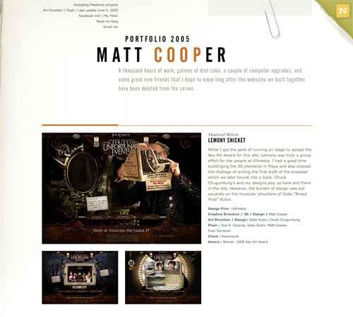
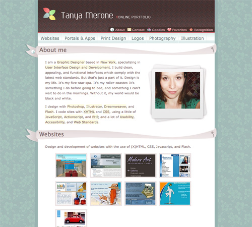
A single-page portfolio site that showcases a dozen movie websites. Minimal information is provided in the header, including a contact link.
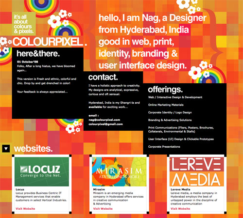
Colourpixel has a lot of varying information on their site, but for the most part everything is kept short and to the point. There’s contact information, a portfolio and about information, all on a single page.
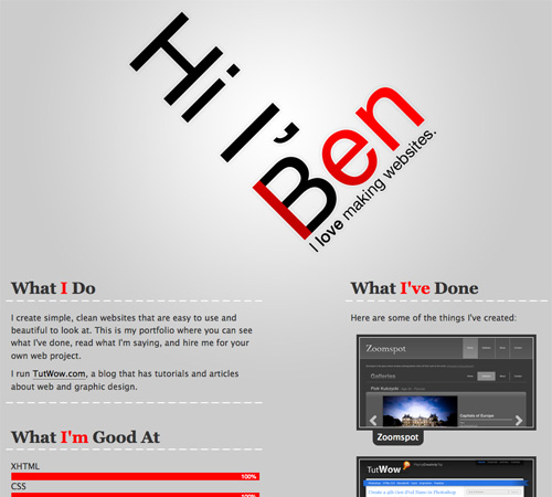
Ben Lind’s website includes only the minimum amount of content to get his message across.
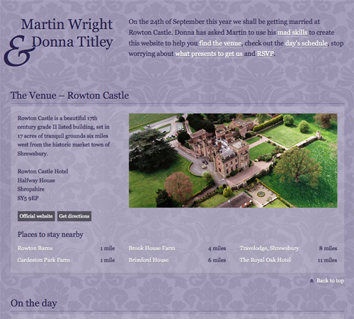
Single-page sites are perfect for things like events (a wedding in this case). There’s not too much content to include and the single page makes it easy to find whatever you’re looking for.
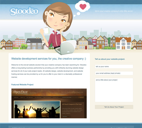
Stoodeo’s site only contain’s a single page worth of content. By placing the contact form to the side, they’ve really minimized the length of the page.
2. Consider Horizontal Scrolling
Not all horizontally-scrolling websites are single page sites. But a fair number of them are, and it’s an interesting way to break out of the standard single-page box.
Horizontal scrolling can also work better if you have more content. Combining a horizontal layout with JavaScript can also facilitate larger amounts of content without overwhelming the visitor.
Examples
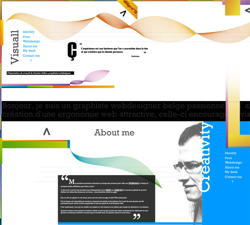
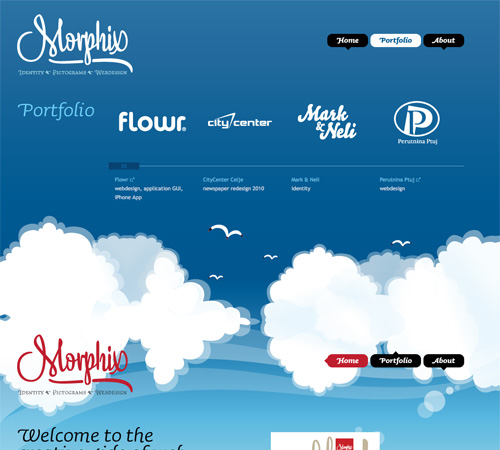
This site incorporates both horizontal and vertical scrolling to get six pages worth of information on a single page.
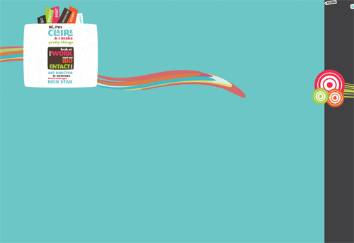
F Claire Baxter’s site is a fantastic example of using JavaScript to create a site that smoothly scrolls horizontally.
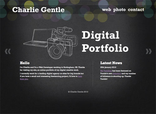
Charlie Gentle’s website uses a horizontal-scrolling slideshow effect to display content.
A huge horizontally-scrolling single page site. They include the contact form right at the beginning, setting it apart from a lot of other horizontal sites that include it on the last screen.
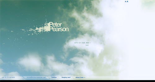
Peter Pearson’s site uses a mix of animation and horizontal scrolling on his site. Multiple pages worth of content are broken up across multiple horizontal screens.
3. Consider Screen Size
With a single-page site, you may want to consider the visible area your visitors likely see within their browser. Crafting your pages to fit comfortably within that space can minimize scrolling while viewing individual sections. This can be particularly important if the transitions between areas are important to you. Once a visitor starts scrolling, they may just keep scrolling rather than using your navigation links.
Examples
This is a very simple, three-screen single page site. Each section of the site easily fits within a single screen and requires no scrolling. The use of bi-directional scrolling to navigate is also a unique touch.
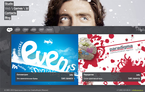
The CreativePeople website uses accordian sliders that come up from the bottom of the screen to display content. No scrolling is required.
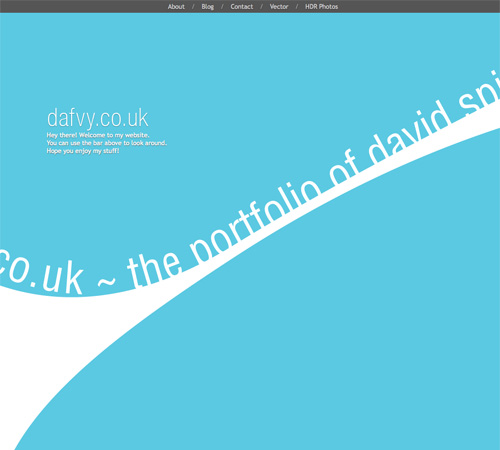
Each content area on the Dafvy.co.uk site fits easily within a single screen with no scrolling required. The background color transitions that occur when you click to navigate to each individual section is a very nice touch.
Fuel Brand uses a single-page that fits within your browser window and uses Ajax to show more content.
A simple site with a slideshow and minimal information. The content adjusts to your screen size.
4. Clearly Set Apart Each Section
Most visitors to your site are going to be used to loading a new page for new content. If you squish all the content on your single-page site too close together, they may not see the transitions from one section the next.
There are a variety of ways to differentiate between sections. Using a header for each content area is one way. Some sites use an actual line to separate different areas. And still other sites use ample amounts of white space to set areas apart from one another.
Examples
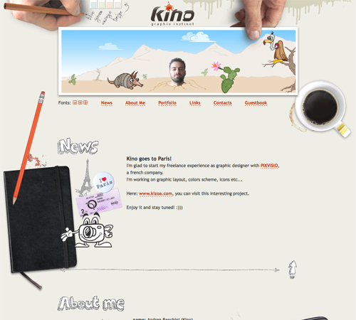
KINO uses consistent hand-drawn headers for each section of the site, along with a thin, hand-drawn border separating each one.
Simple banners between each section keep a consistent look throughout the page while setting apart each content area.
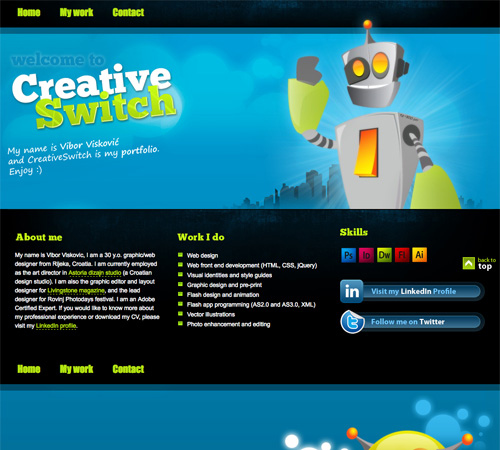
CreativeSwitch uses images similar to distinct headers for each section of the site, clearly marking transitions between different types of content.
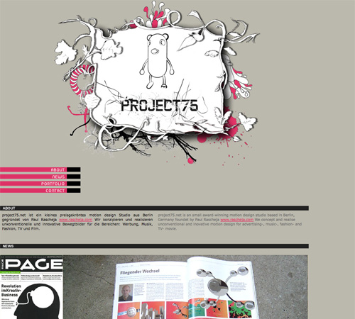
Even something as simple as a thick black bar can be enough to set your content areas apart from each other, as is done here.
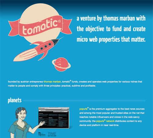
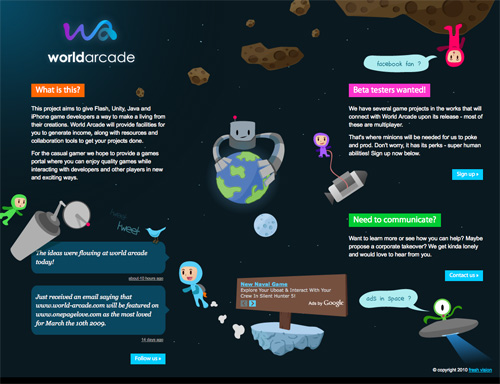
The Tomatic website uses a retro rocket and space exploration theme. The header includes a rocket with planets. Various other sections on the site continue the retro theme, and then the footer includes a robot and UFO on a planet’s surface. Each section is set off with a unified header.
5. Take Advantage of a Bigger Background
Big backgrounds are popular in all kinds of website design, but single page designs open up new possibilities for large backgrounds. Many designers take advantage of large background images as a way to set apart their content areas while maintaining a unified look to the entire site.
For example, some sites might have a scene in the background that starts with a sky at the top with one content area, then further down they have a ground-level scene with another content area, and at the bottom they have an underwater scene with yet another content area. The possibilities with this kind of site are almost endless.
Examples
This coming soon page is another great example of using a unified theme throughout the site.
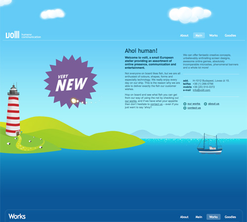
The Volll site uses a seascape/landscape image for the background, with the main content at sea level. Additional information shows up above the main content in the sky and below in the water, right down to the ocean floor.
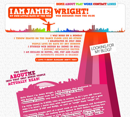
Jamie Wright’s site uses a more abstract, colorful theme throughout. It really sets the site apart and draws your attention exactly where it should be.
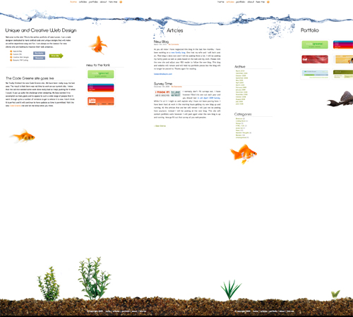
Luke Larsen’s site uses a background that resembles a goldfish bowl.
This is one of the most innovative background designs I’ve seen. As you scroll down the page, colored bars in the background interact with other background elements to produce a one-of-a-kind effect that’s hard to even explain (so go check it out!).
6. Use JavaScript and Ajax to Organize and Display Content
If you have a bit more content to display but still want to stick to a single page design, consider using JS and Ajax to hide some content while others is displayed.
Slideshows are the most popular techniques for incorporating JS, but modal windows and other methods are also used.
Examples
SOFA uses JavaScript to display content on the home page as needed. It results in a very clean, polished design that still presents the necessary information without requiring visitors to leave the main page.
The Giant Creative site uses a JavaScript slideshow to display content while keeping the visitor on a single page.
Deluge Studios uses a variety of slideshows, modal windows, and other JavaScript techniques to include more information on their website than is immediately apparent.
The TapTapTap website uses JavaScript to load information about each of their products without loading a new page.
Jon Brousseau’s site uses JS for subtle enhancements like modal windows and tooltips.
More Examples
Below are a bunch of other great single-page website designs.
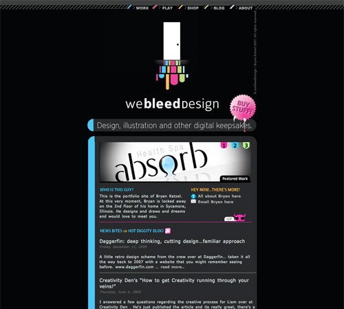
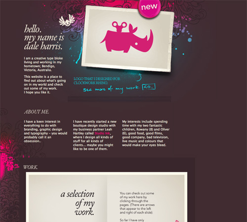
Dale Harris
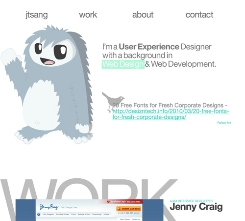
Justin Tsang
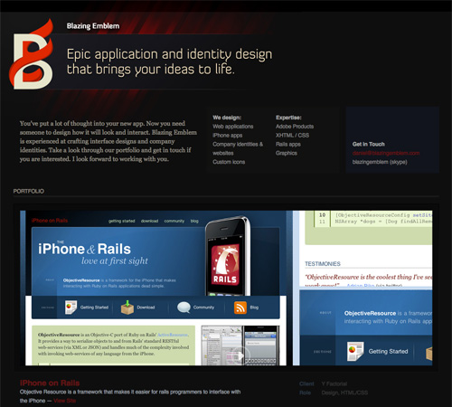
Blazing Emblem, LLC
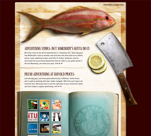
Fish Marketing
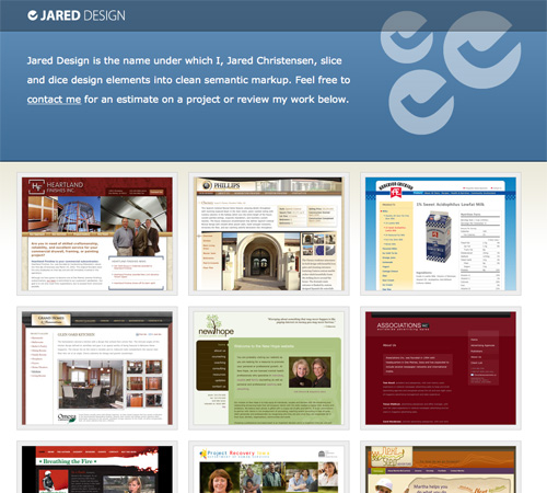
Jared Design
Angel Des Lacs
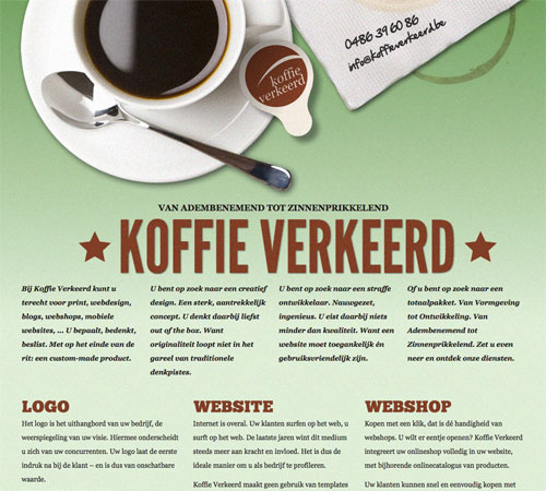
Koffie Verkeerd
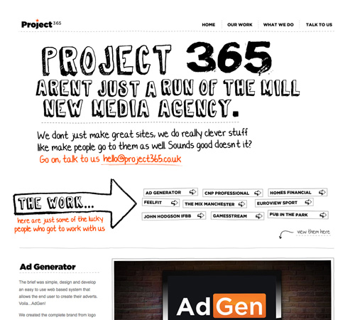
Project 365
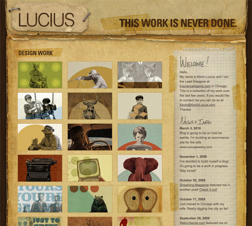
Kevin Lucius
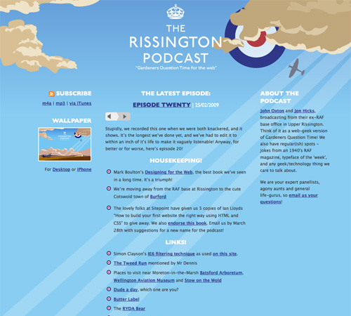
The Rissington Podcast
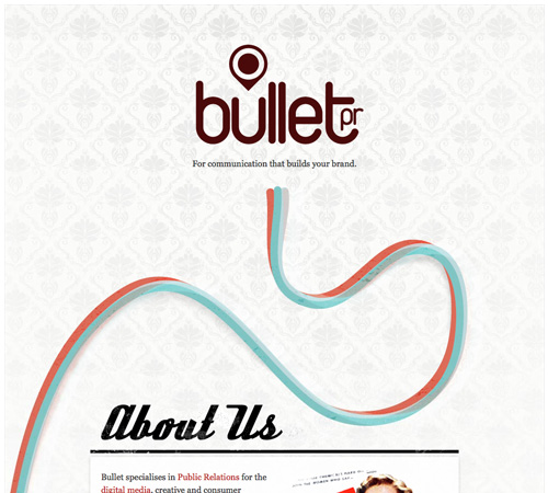
Bullet PR
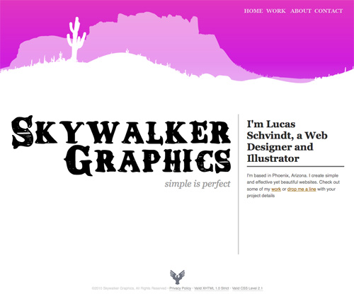
Skywalker Graphics
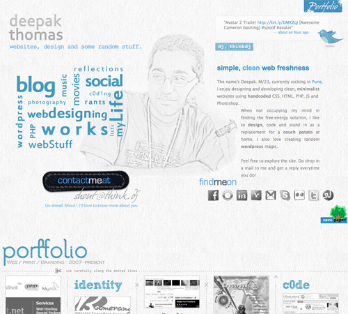
thinkdj
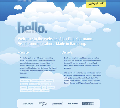
Jan-Eike Koormann
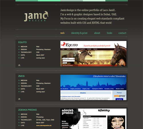
Janic Design
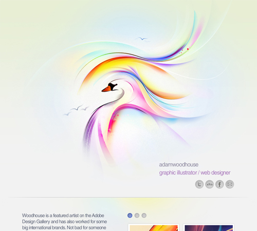
Adam Woodhouse
Paolo Manganiello
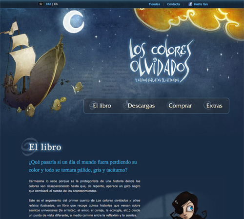
Los Colores Olvidados
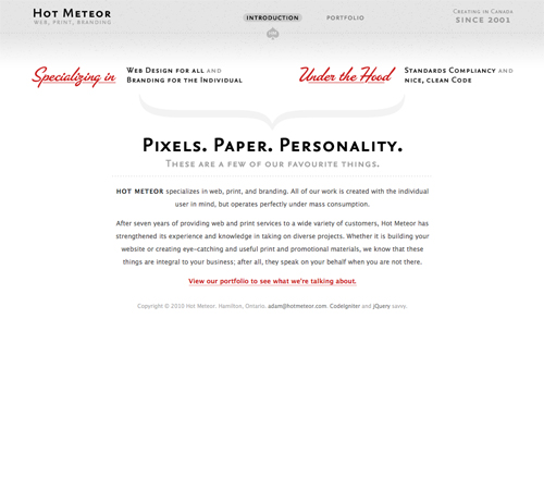
Hot Meteor
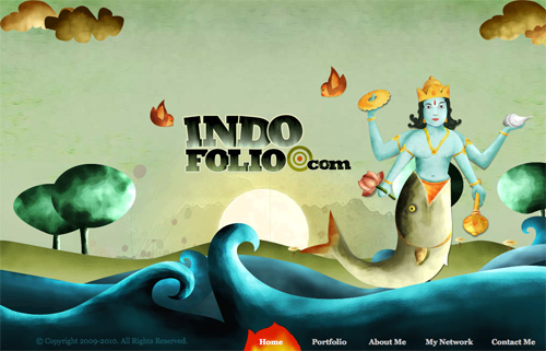
IndoFolio
In Review…
One-page websites can be a fun and different way to design a site, whether it’s your own personal site or for a client. Consider ways to differentiate your one-page site that might not work as well on a multi-page site. Things like big background images or certain Ajax techniques work really well on one-page sites and have a bigger impact than they do on more complex sites.
Here’s a quick run-down of the best-practices mentioned above:
- Minimal content. There’s only room for so much content on a single page.
- Consider horizontal scrolling. While not all horizontal-scrolling websites are single pages, it’s a format that lends itself well to the one-page format.
- Consider screen size. Creating content areas that fit within a visitor’s screen without requiring scrolling is common in single-page sites.
- Clearly set apart each section. You don’t have the convention of separate pages for different content, so you need to figure out another way to delineate content areas.
- Take advantage of bigger backgrounds. Single page sites are often longer or larger than other pages, giving more opportunities for creative use of big backgrounds.
- Use JavaScript and Ajax. Organizing a lot of content on a single page can be enhanced if you use Ajax or JS techniques like modal windows, tooltips and sliders.
Showcases
Resources:
 Insert Google Maps - This extra functionality will make it easier for your customers to (physically) navigate to the location of your company.
 Insert address(es) of your company - Our Local SEO plugin makes it easy to show your company address(es) in a clear and uniform format, while adding all the necessary technical markup for search engines.
 Insert opening hours of your company - Our Local SEO plugin makes it easy to show your opening hours in a clear and uniform format.
 Insert a store locator - The store locator will allow customers to easily find the nearest location of your company. Customers can fill in their home address and a list of the nearest locations of your company will appear.